How to build beautiful and minimalistic HTML form with less code
Styling HTML form can be daunting for beginners. I'm here to help you build beautiful and minimalistic HTML forms with less code in less than 20 mins.

Programmer | Full Stack Web Developer
Creating a decent web page doesn't need you to have a masters or PhD in styling and designing. You just need excellent googling skills and blogs like these😄.
I hope you find this blog useful. So, let's not delay this any further.
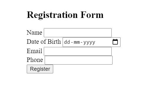
To start with, we have a very simple HTML form without any styling applied to it.
In next few steps, we'll apply certain CSS rules which will make our HTML form look attractive.
Select font for your form.
First things first, always choose fonts which are easier on the eyes (e.g., sans serif).
I use google fonts to find the best suited font for the project. For this project I’ll be using Atkinson Hyperlegible font style.
After choosing the font, we'll add these to our style.css file:
@import url('https://fonts.googleapis.com/css2?family=Atkinson+Hyperlegible:wght@400;700&display=swap');

*{
font-family: 'Atkinson Hyperlegible', sans-serif;
margin:0px;
}
label{
  font-size:14px;
  font-weight:600;
}
Tip : Don’t use too many fonts. Instead, try playing with font size, font weight and style like bold, italics of the same font.
Adjust element spacing.
Looking at our form, it looks like spacing is a little off. So, we fiddle with the padding on form and center the form,
*{
/*…existing styles…*/
line-height: 28px;
box-sizing: border-box;
}
h2{
  padding:1em;
  text-align: center;
}
form{
  padding:2em;
  margin: auto;
  max-width: 370px;
}
input{
  padding: 4px 16px;
  width: 100%;
}
button{
  padding: 4px 16px;
  width: 100%;
  margin: 10px 0;
  font-weight: 600;
}
...and this is the result,
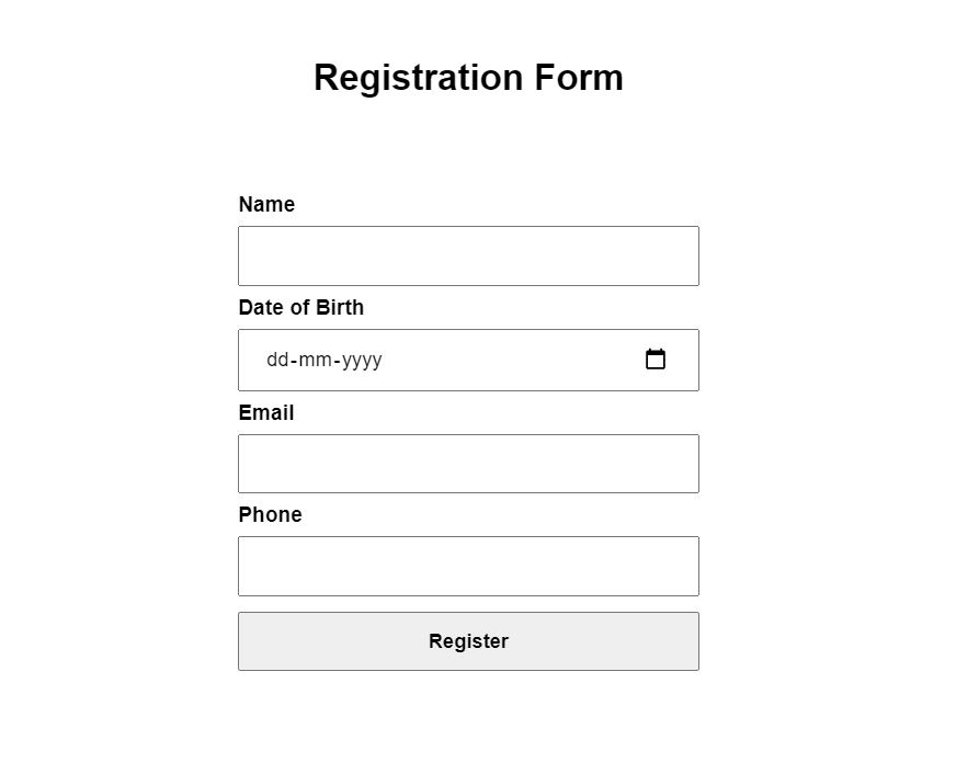
Now this looks much butter.
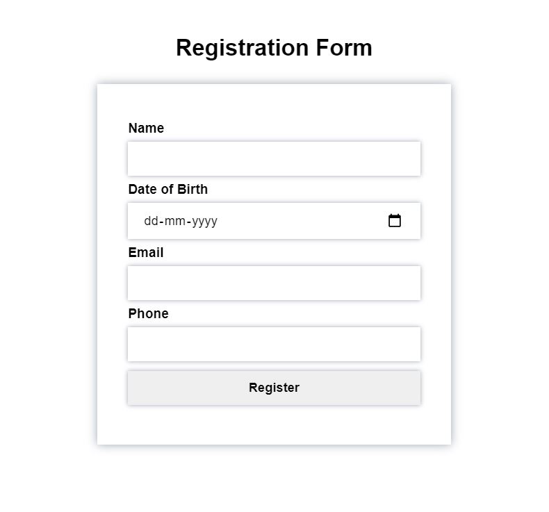
Adding Box-shadow
Box-shadow is really cool way of giving a slimming 3-D effect to your webpage. It can be used for <div> and boxes within your layout.
If you have less time, then, this will definitely empathize the form's input and button fields in seconds.
We'll add box-shadows for <input> and <button> tags in style.css file.
input{
/*…existing styles…*/
border: unset;
box-shadow: 0 0 10px #9CA3AF;
}
button{
/*…existing styles…*/
border: unset;
box-shadow: 0 0 10px #9CA3AF;
}
Note : remember to remove the default border on the <input> and <button> tags by using border: unset;
And this is how it looks:
Adding pop of Color.
Professional web designers, have a color palette, carefully chosen to design harmonious websites.
But not everyone is pro in the beginning. If you cannot think of good color scheme, then just go with gradients. The ever-popular CSS3 gradients provides web developers with variety of color palettes.
I prefer using uigradients, it has wide range of color schemes.
So, let’s add some CSS3 goodness.
.registration-box{
  background-color:#ffeeee;
}
h2{
/*…existing styles…*/
  color:#ec008c;
}
form{
/*…existing styles…*/
  background-color: #fff;
}
button{
/*…existing styles…*/
  background: linear-gradient(to right, #ec008c, #fc6767);
  color: #fff;
}
And we have,
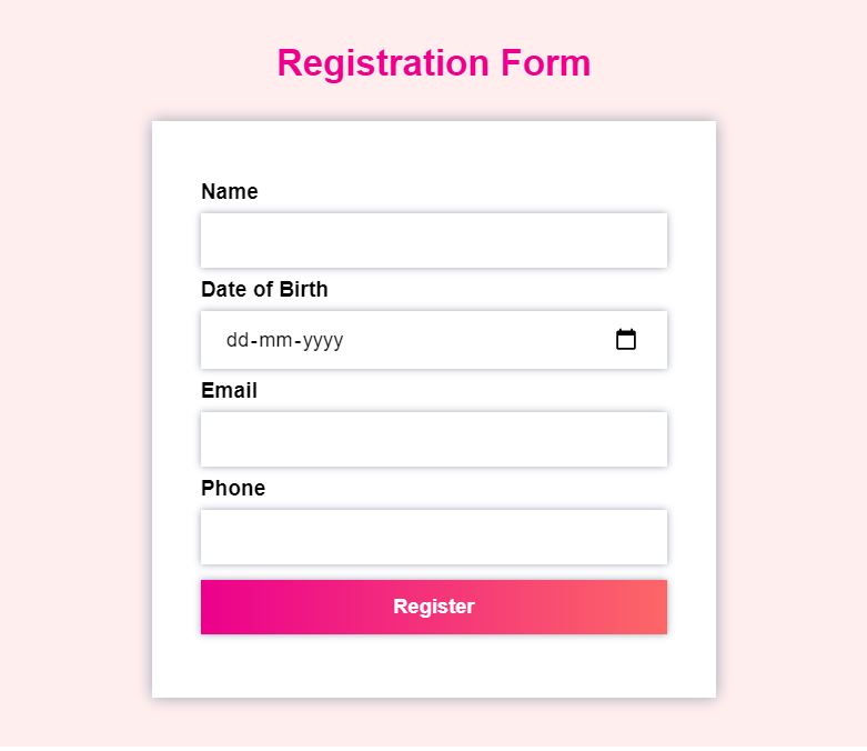
This is looking good, but we want our form to have a softer look, so let's add a rule border-radius:10px; for <input>, <button> and <form>
form{
/*…existing styles…*/
    border-radius:40px;
}
input{
/*…existing styles…*/
    border-radius:10px;
}
button{
/*…existing styles…*/
    border-radius:10px;
}
Now our example looks like this.
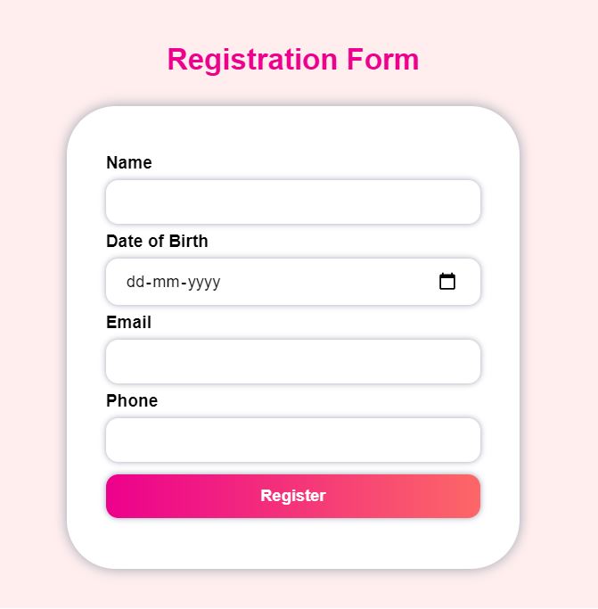
We're almost done, but there are some small details that will enhance our form design.
Small things can make a big difference.
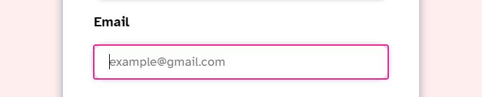
Adding Small Details.
- Adding highlight on the input fields when in focus.
input{
/*…existing styles…*/
  outline-color: #fe1493;
}
Changing the cursor to pointer when we hover the button:
button{
/*…existing styles…*/
 cursor: pointer;
}
Applying transform on the button when we hover. If you don’t want to scratch your head understanding keyframes, transitions then just use scale. This can be achieved by adding below rule.
button: hover {
/*…existing styles…*/
  transform: scale(1.1);
}
Finally, our form looks like this.
It's definitely not going to win any awards😅, but it's definitely better and more attractive than before.
With the above techniques, you can make a form look slightly more pleasing.
Closing thoughts
You should definitely invest some time in learning basic design principles like choosing colors, layout, fonts and typefaces. It will improve your skills and make this designing journey more fun.
PS : I am a still in the learning phase and would like to know more on improving design. Do share you input in the comments section.


